




F&P Marketing Assets
2024-Present
objective
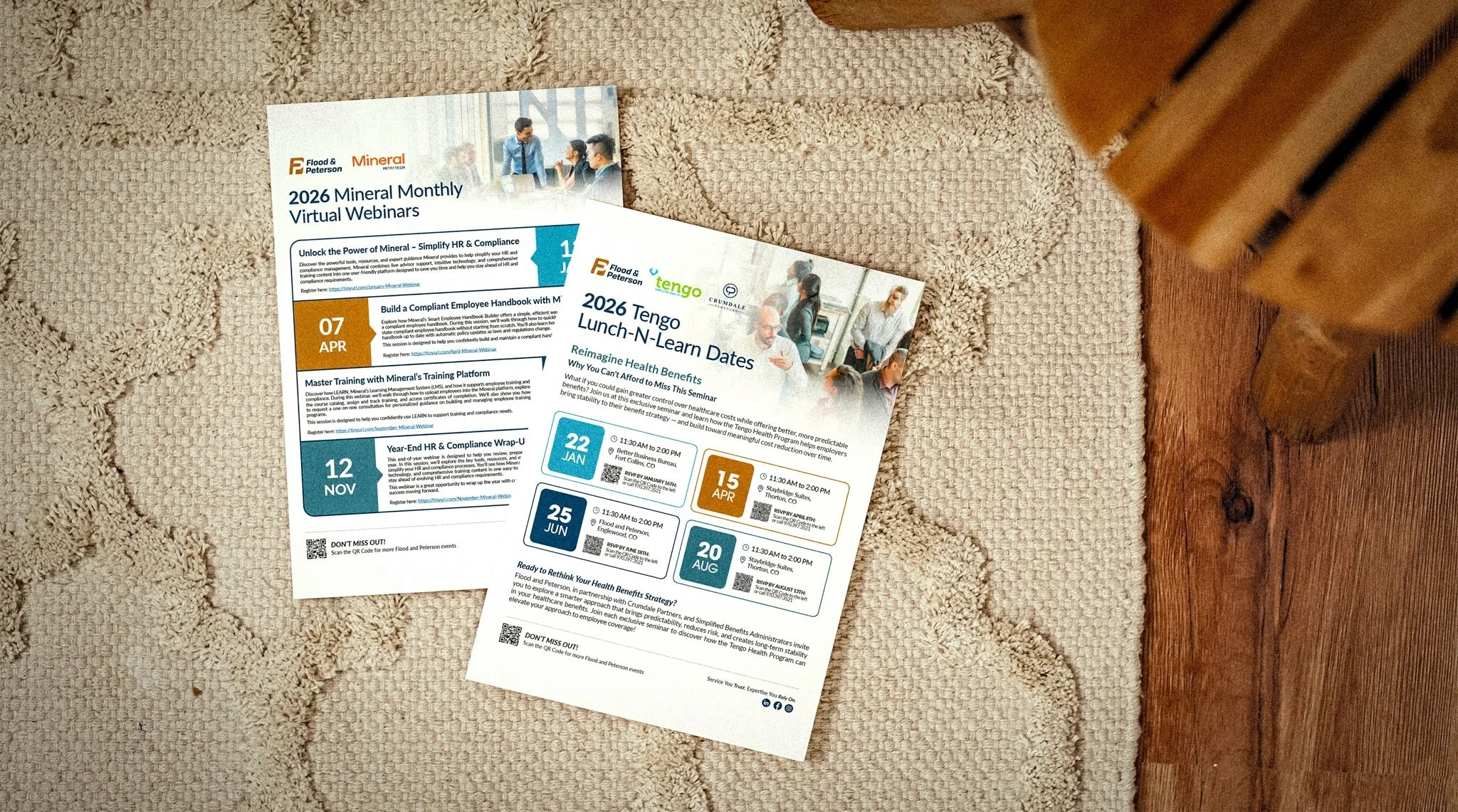
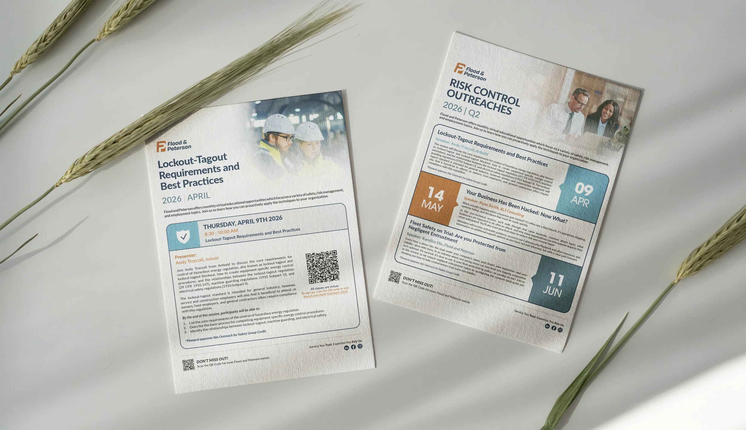
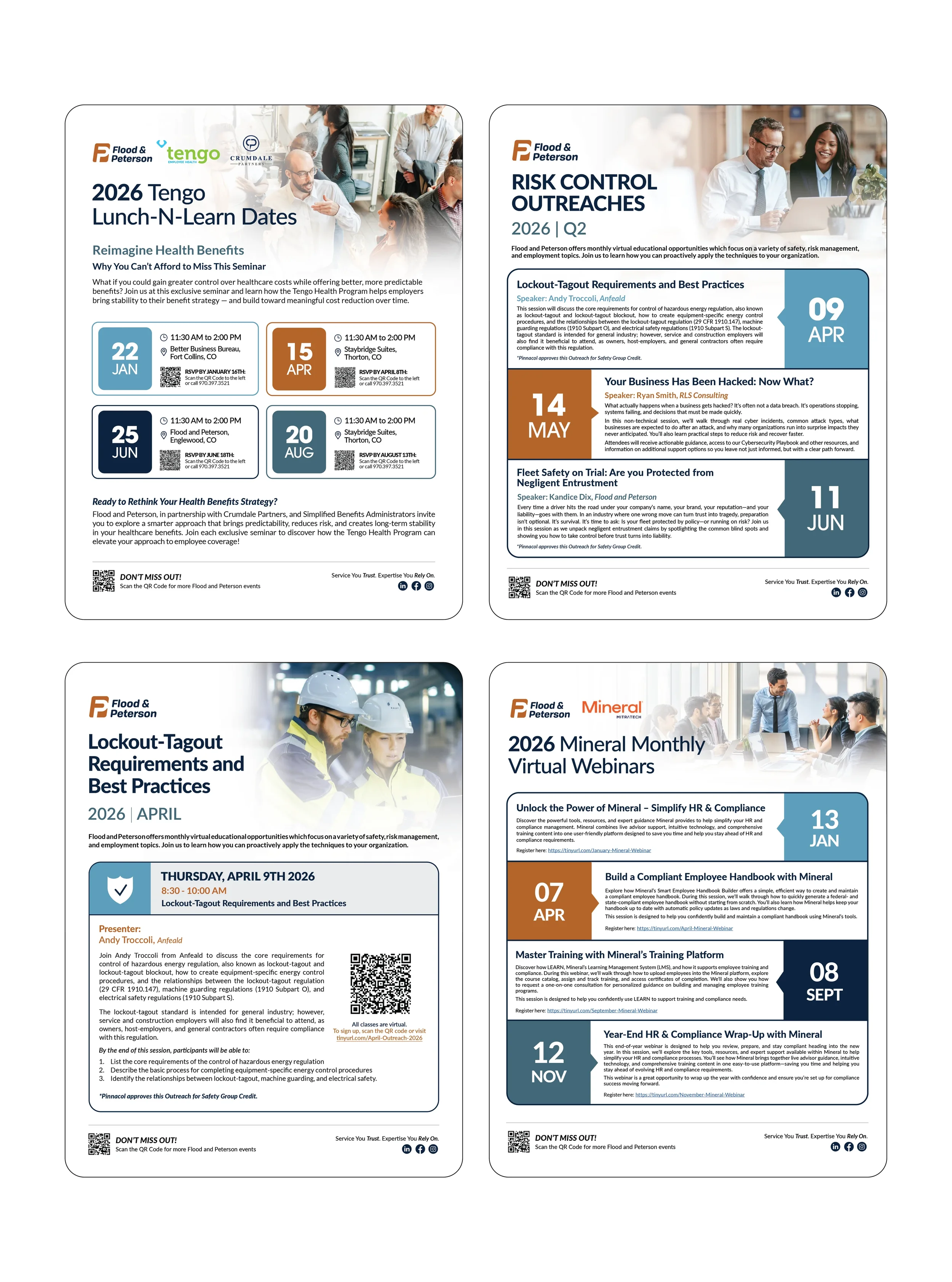
This collection highlights a variety of marketing and outreach materials created to support Flood and Peterson's events, client education initiatives, and business development efforts. One of the key projects featured is a series of monthly webinar promotions developed for Flood and Peterson's Risk Control team. These webinars cover a range of topics related to safety, risk management, and employment practices. I was given the opportunity to refresh and modernize the existing promotional materials, creating a more cohesive and timeless visual style that better aligned with our evolving brand.
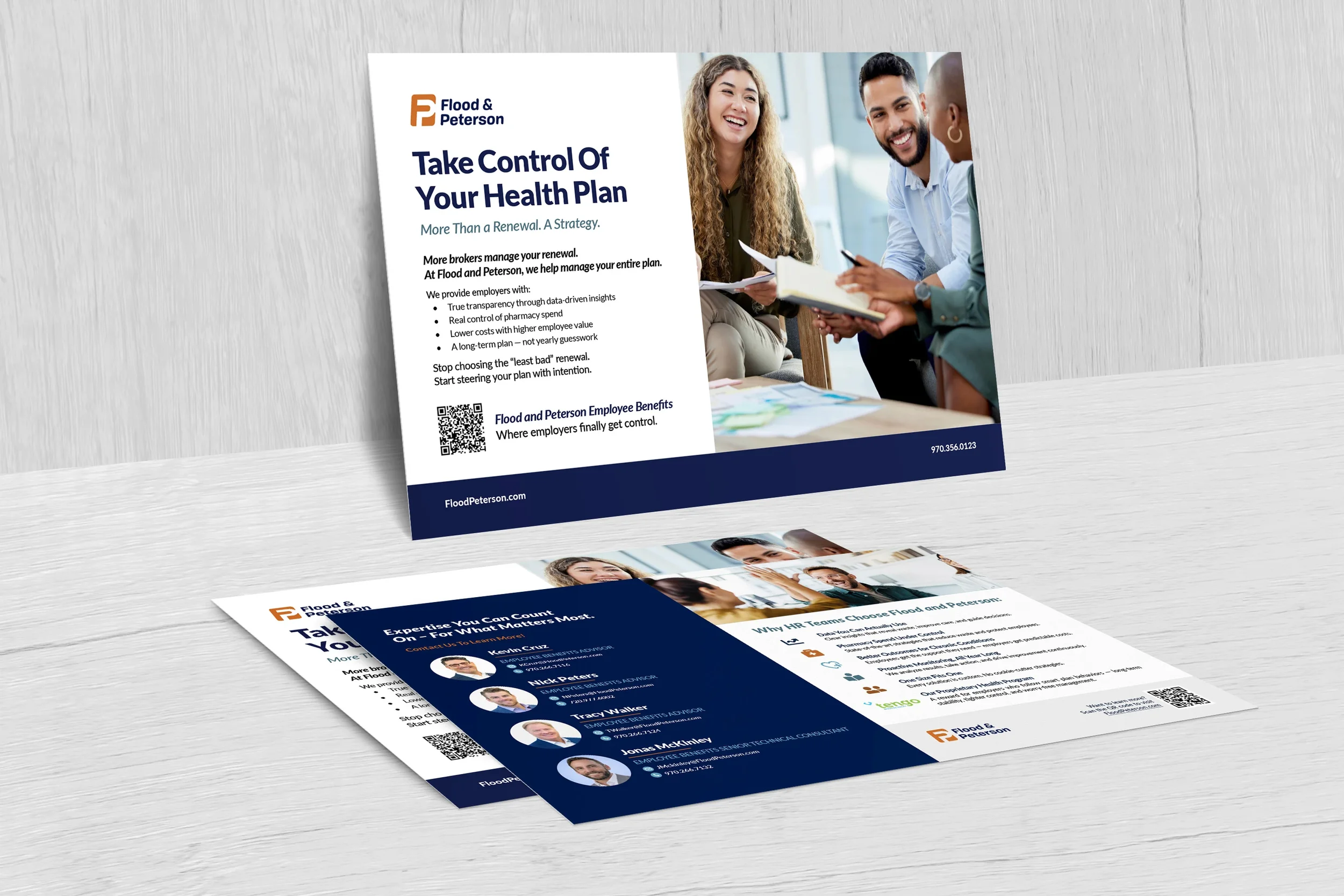
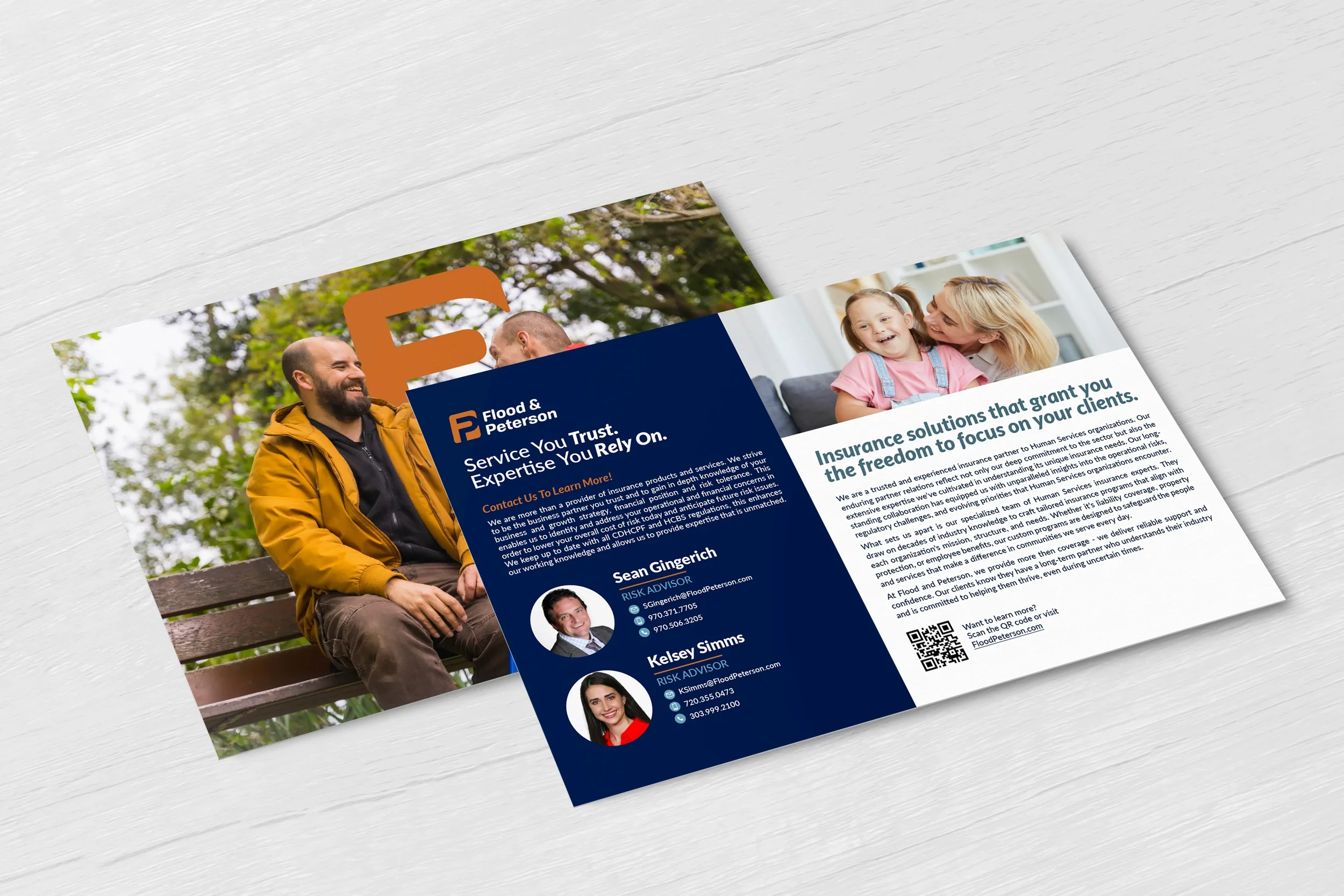
Beyond the webinar campaigns, I have also worked closely with several departments, including our Benefits and Human Services teams, to develop customized outreach materials for industry events, networking opportunities, and prospect meetings. Rather than relying solely on traditional 8.5" x 11" service sheets, I helped introduce more targeted and engaging collateral, including postcard-sized leave-behinds designed to start conversations and create a stronger first impression. These pieces provide a more approachable way to communicate our services while giving teams a practical tool to use during face-to-face interactions.
impact
What I value most about these projects is the opportunity to enhance how our company presents itself to clients and prospects. By modernizing outdated materials and creating more intentional, audience-focused designs, I was able to help support outreach efforts across multiple teams while strengthening the overall consistency of the Flood and Peterson brand. The result is a collection of materials that not only looks more polished and professional but also better reflects who we are and how we serve our clients.